Modern website designs: Trends and actionable tips for 2025
When you search for “modern website designs,” you'll definitely find some cool examples. But all those lists have one thing in common: they stop short of delivering the practical, hands-on guidance agency owners really need.
While the phrase “modern website design” might seem straightforward to seasoned web professionals, it's a lot more than just pictures, colors, and buttons on a page. Its nuances profoundly shape user expectations, brand perception, and a site’s long-term viability. In fact, web design is responsible for 94% of a visitor’s first impression of your clients’ businesses.
In today's post, we’ll take a forward-looking approach to 2025’s most important design trends. And we'll give you actionable steps to take so you can confidently integrate them into your agency’s web design process.
Our top 11 website design trends for 2025
1. Maximalist typography
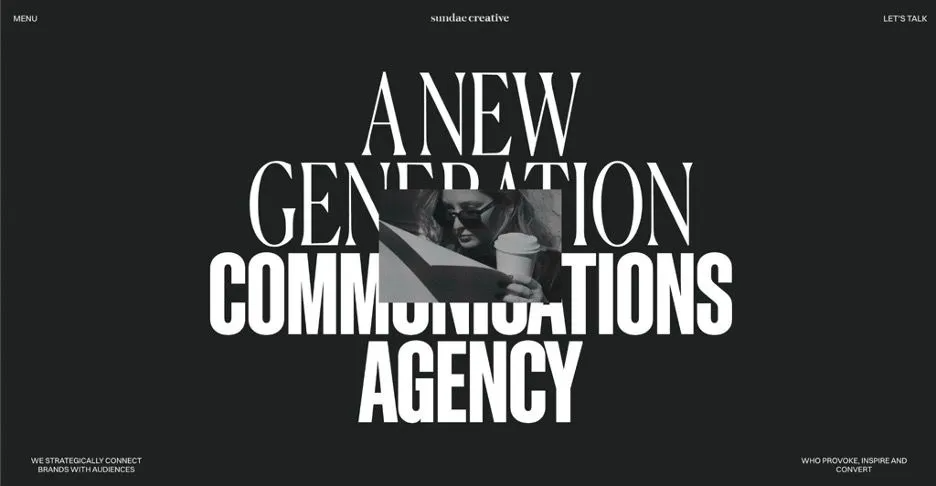
They say, "A picture is worth a thousand words." With maximalist typography, where large, layered text is used to make a bold visual statement, the words are part of the picture. In fact, they're the focal point.
- Expressive fonts bring out the personality of a brand and convey its message (and they're attention-grabbing).
- Layering different fonts within images adds depth to a design, making it more visually interesting.
- Bold titles establish a clear visual hierarchy, making the rest of the site’s content easy to scroll.
- Best of all, they can actually simplify the web design process (since the text replaces at least some complex images or illustrations).
Keep in mind that if you're going to go this route, you need to use high-contrast colors and font pairings for maximum impact.
Best for: Promotional landing pages, creative websites (e.g., photography, fashion brands), hero images, and specific brand messaging.
2. Playful and interactive websites
One of our favorite trends over the last year has been the increasing use of website animations and interactive design elements.
- Parallax scrolling, where the background of a website moves slower than the foreground creates a 3D effect.
- Interactive menus and buttons that change color or shape when hovered over.
- Microinteractions, like small animations or sounds that respond to user actions (e.g., a loading animation, a progress completion bar, a click animation).
- Loading animations that include progress, fun facts, or a playful image to entertain users while they wait.
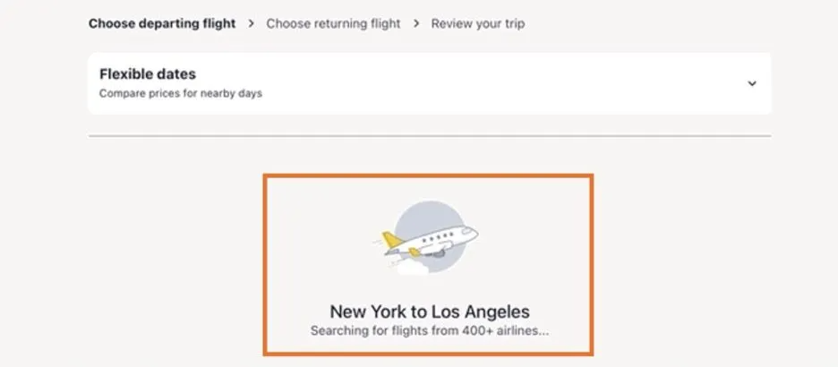
You can use these to make the site experience more engaging, which is especially important in the case of an interactive loading screen. Users will abandon a website that takes longer than three seconds to load, but the issue could be with their WiFi connection or a slow server, not your client’s site. By keeping their site visitors entertained, you can use this to reduce their bounce rate.
For instance, Expedia shows a plane flying through clouds, and updates visitors on what the site is doing in the background (in this case, searching through flights in their database).
One of our favorite trends over the last year has been the increasing use of website animations and interactive design elements.
- Parallax scrolling, where the background of a website moves slower than the foreground creates a 3D effect.
- Interactive menus and buttons that change color or shape when hovered over.
- Microinteractions, like small animations or sounds that respond to user actions (e.g., a loading animation, a progress completion bar, a click animation).
- Loading animations that include progress, fun facts, or a playful image to entertain users while they wait.
You can use these to make the site experience more engaging, which is especially important in the case of an interactive loading screen. Users will abandon a website that takes longer than three seconds to load, but the issue could be with their WiFi connection or a slow server, not your client’s site. By keeping their site visitors entertained, you can use this to reduce their bounce rate.
For instance, Expedia shows a plane flying through clouds, and updates visitors on what the site is doing in the background (in this case, searching through flights in their database).
You can also use them to drive conversions for your clients. See this coffee cup? The animation makes it more fun to click, so more users are likely to do so.
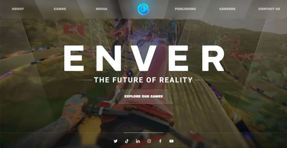
You can also use interactivity to demo a product or help customers get to know it right from the home screen. VR Game Developer Enver Studio uses their home page to show users what it's like to play their popular game, MotoX.
3. White space, negative space, and minimalism
"Less is more." Although lots of designers are going maximalist with their text content, there's still a big trend towards minimalism and the use of white space. In fact, that's how they make their maximalist text pop.
White space (or negative space) refers to the empty or unmarked area of a design, and it's as important as the elements on the page. It helps to create balance, contrast, and visual hierarchy. It also reduces cognitive load and makes the important elements on the page stand out.
Minimalism is also a way to reinforce your clients’ branding. If the product already prioritizes sleek design, minimalist packaging, a luxurious feel, and easy-to-use features, reflecting that in the website design is an absolute MUST!
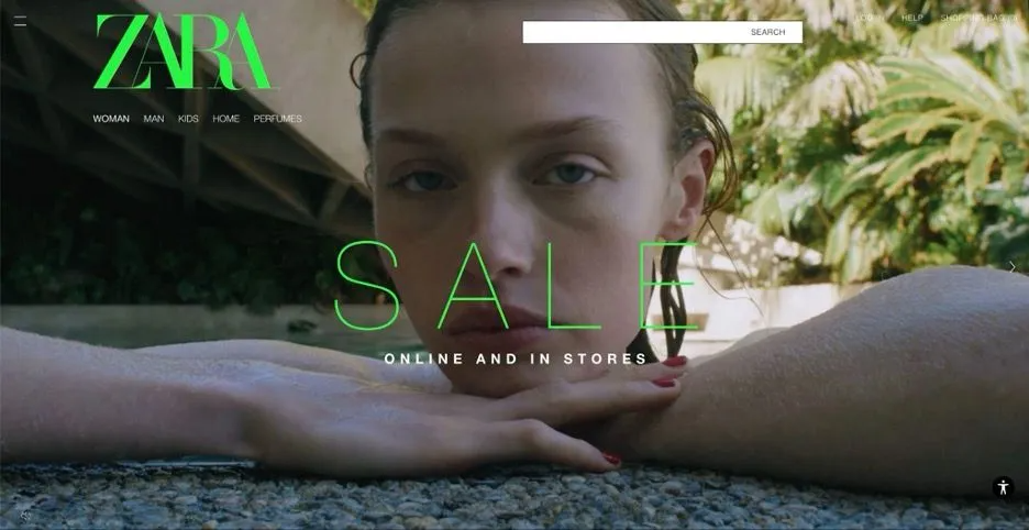
Best for: Brands that exemplify minimalism in their values and aesthetics, such as Apple, Muji, or Zara.
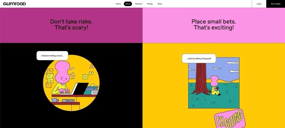
4. Bright, bold, and vibrant colors
Whether you realize it or not, every color you choose will have a profound impact on how people feel when they visit your clients' websites. Just like grayscale colors can demonstrate sleekness and luxury, bright and bold colors can convey confidence, energy, excitement, and enthusiasm.
Gumroad uses bold, bright colors to make an emotional connection with their visitors. They want to make their brand feel lively and engaging, just like starting an online business should be.
Vibrant colors are also great for grabbing attention and making important elements stand out.
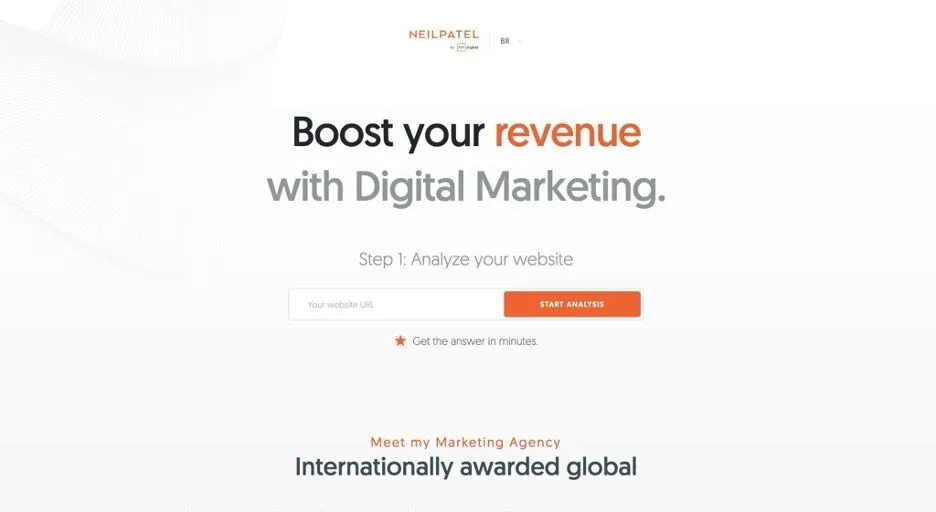
On Neil Patel's homepage, he uses white space to create a clean and minimalist design, but uses his classic bright orange branding to highlight the most important word (revenue) and the CTA button, to draw users' attention toward the free website analysis he's offering.
Best for: Brands with colorful branding, important UI elements, and a playful or energetic tone.
5. Mobile-first, responsive design
Google's mobile-first indexing requirements mean search engine crawlers will prioritize the mobile version of your clients' website content, rather than the desktop version. And, in January 2024, mobile site visits (excluding tablets) accounted for more than 60% of all web traffic.
This makes responsive design among the most important considerations for modern website design. It guarantees the website can be easily viewed and navigated on any device, from smartphones to tablets and desktop computers.
The mobile version of the site should have:
- The hero, main copy, and CTA before scrolling
- Bigger font sizes and clickable icons, buttons, and links for touchscreen usage
- No horizontal scrolling — text and images should fit within the screen width
- Simple, app-like navigation that's suited for touchscreen usage
Our website builder puts responsiveness at the forefront. This makes it easy for agency owners to implement and maintain responsive websites, with minimal input on their end.
Best for: ALL websites — this is a basic requirement for modern website design, and all your clients should have a responsive website to ensure optimal user experience and search engine ranking.
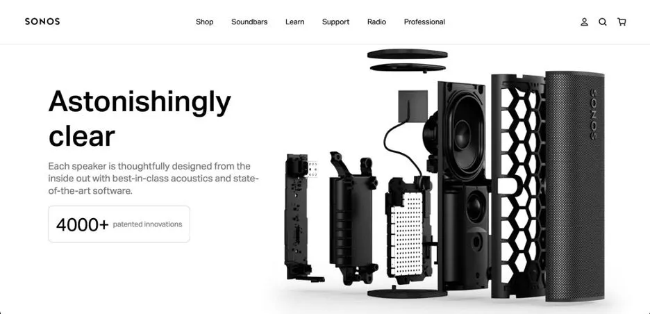
6. Hi-res and big images
All over, we're seeing images take the forefront on websites. High-quality, large images can grab attention and give a visual break to text-heavy pages.
You can use images to:
- Showcase a product you want to highlight
- Convey a certain type of "vibe" or emotion that aligns with your client’s brand or website
- Break up text-heavy pages and make content more digestible
It’s also an integral part of SaaS website design — our current homepage uses a near-full-screen image to show how our site builder functions and give viewers a taste of the features.
The important thing to remember is to not mix text-heavy and image-heavy designs. When the two overlap, it makes the image hard to see and the text hard to read — it's all cluttered together.
7. Personalized images generated by AI
Some brands use AI to generate their images, rather than creating one on their own. There are plenty of tools you can use to instantly generate images for a client’s website, from landscapes and portraits to abstract illustrations. Just enter a prompt and it'll do the heavy lifting for you.
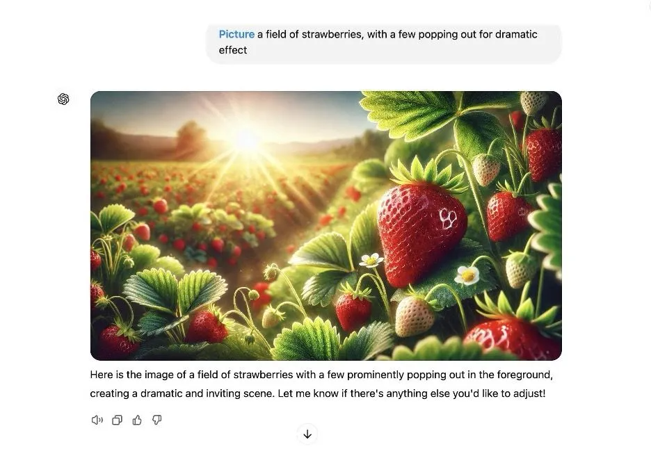
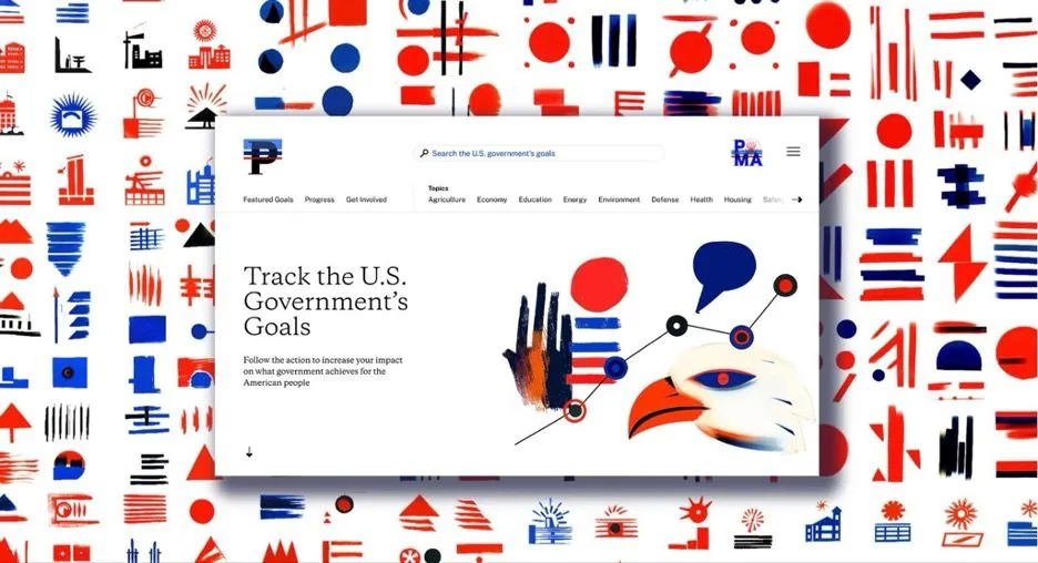
There are a lot of considerations when using AI-generated images (like licensing and originality), but when done right, the results are astounding. Take Pentagram Agency's recent work (which agency Partner Paula Scher vehemently defended) on Performance.gov, a U.S. government website.
All these images were created using MidJourney:
You can also use AI image generator tools as a starting point if your team is having a bit of designer's block.
Best for: Websites that need high-quality, original images quickly and easily.
8. Anti-design
Anti-design is a concept where all the elements of a design are intentionally made to be unconventional and visually jarring. It goes against traditional aesthetics and rules, resulting in a unique, attention-grabbing, and, in its own way, beautiful design.
Take Kitchen 154, a restaurant in Madrid. Its website features tons of scribbles and is made to look like it was made in a drawing program. In the upper left corner, you can actually click and add your own illustrations.

Or Advisory Board Crystals, a clothing brand from Los Angeles. The opening page of the website features two buttons: a giant padlocked door and a glowing, colorful stone. Neither has any indication what they're supposed to do (and the padlock doesn't even open).

What you'll notice about every "anti-design" concept is that they're all completely different. If you're going to go this route for one of your clients, make sure it's aligned with their branding and personality, and no one else's.
Keep in mind that the one design principle you should never sacrifice is usability. Things like navigation clarity, readability, and accessibility should always be kept in mind, no matter how unconventional the design may be. Make the important elements visible and clickable, and don't hide or obscure important information.
Best for: Creative industries, art-based portfolios, and brands with edgy or rebellious identities.
9. Dark mode
"Dark mode" is the mode you switch on your smartphone when you're reading in bed and want to minimize screen glare. But it's also an increasingly popular trend in design for its energy efficiency, eye-friendliness, and ability to enhance certain brand aesthetics.
It involves using a color scheme that is the opposite of traditional light-colored design. Instead of white backgrounds throughout the website, dark mode uses black as the primary background color.
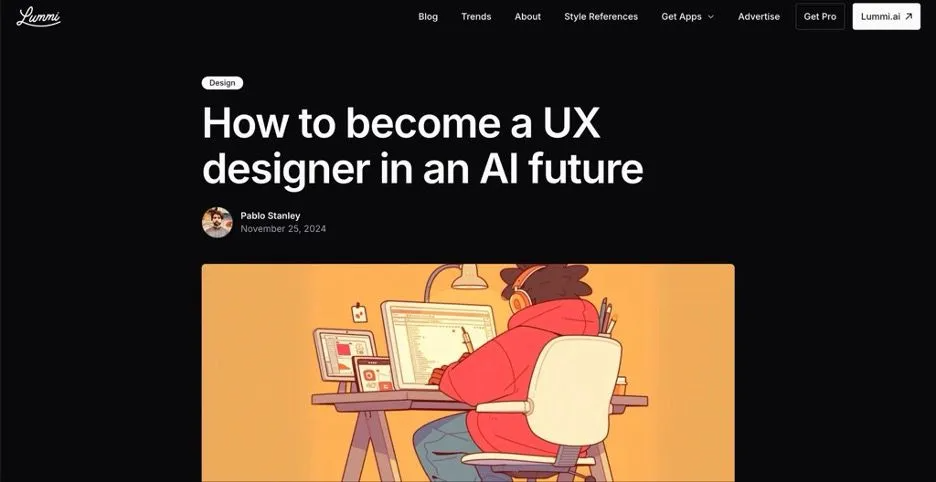
For instance, AI photo generator Lummi uses dark mode on its blog posts:
What you have to remember is that dark screens are hard to read when it's bright outside. So, to maximize usaility, you should always display a toggle button that allows users to switch between light and dark modes. And use neutral hues and maintain sufficient contrast for legibility.
Best for: Brands in tech, gaming, consumer electronics, and entertainment industries, as well as brands that want to convey a sleek and modern image.
10. Custom illustrations
There's also been quite a big shift away from generic stock visuals (boooring!) and toward hand-drawn illustrations. The Kitchen 154 example we showed you above is one extreme example, but there are ways to do this while abiding by traditional design principles.
Custom illustrations can add personality, charm, and a unique touch to the brand's visual identity. They're also great for visually communicating complex or abstract concepts.
There are two ways you can go about them:
- Hire an artist to create original illustrations from scratch.
- Use a tool like Procreate.
Design agency Designjoy uses custom illustrations throughout its single-page website (and has a pack of vectorized illustrations available for free).
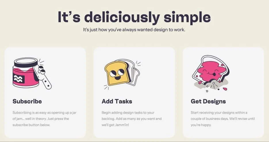
Jamm uses playful caricatures of PB&J to lean into their brand name and come off as more personable.
Best for: Any client project that needs a touch of whimsy.
11. Sustainable, inclusive, and accessible web design
There are two parts to this.
Sustainability is exactly what it sounds like: reducing the environmental impact of a client's website. It means decreasing the page's load time through simplicity and creating timeless designs that don't require enormous amounts of resources to constantly update.
If your client is in an industry that values eco-friendliness, you can also add elements of sustainability into the design itself, such as using backgrounds that look like recycled materials, adding leaves, or incorporating green colors.
Inclusive design is all about designing for everyone, regardless of their abilities. There are actual guidelines for this (WCAG 2.2, if you're interested, and we've written about the latest updates here), but the main idea is making sure designs are:
- Perceivable: Can users access all the information on your client's site, regardless of their abilities?
- Operable: Can they navigate and interact with it easily?
- Understanable: Is its content clear and easy to understand for all users?
- Robust: Does it work on different devices and assistive technologies?
Best for: ALL websites — accessibility is one of the most important factors for both users and search engines.
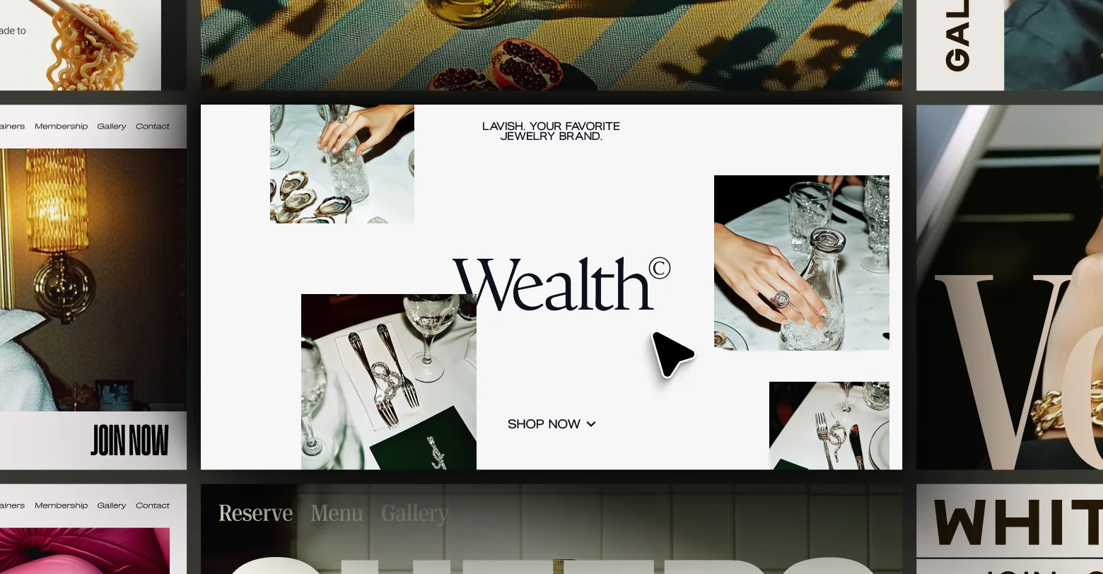
What makes it modern, you ask?
- It shows consistency. Throughout the entire site, the fonts, branding, color scheme, and images speak the same language and convey the same message. This creates a cohesive and professional look.
- Visuals are high-quality. Every image is high-res, so there won't be any pixelated or blurry images. (Hint: We generated all the photos using MidJourney!)
- It incorporates negative space. Notice how there is ample white space between the elements on each section of the scroll? We made sure important details like hours of operation and buttons to reserve a table or view a menu have plenty of room to breathe.
- It's responsive. The template is designed to look great on any device, whether it's a desktop, tablet, or smartphone.
- It's accessible. The font size is large enough to be easily read by those with visual impairments, and the colors provide a high contrast for easy viewing.
- There are just the right amount of interactive elements. Entrance animation, scrolling animation, and hover effects make the site more dynamic and engaging, without being overbearing.
- Typography is bold and visible. For titles, value propositions, and important information (e.g., Christmas hours), the words on the page are large and bold enough to naturally guide site visitors’ eyes to them.
Best practices for implementing modern website design
Now...trends are only as good as the concept that they are applied to. And they're only as good as the execution.
And what's the key differentiator when it comes to this?
Functionality. The reason we're seeing these trends is that, in addition to looking nice, they help create a more user-friendly experience that drives conversions, user retention, and operational scalability.
Here are our best practices for truly functional modern website design:
1. Prioritize user-centricity.
Of all the things that can increase a site’s bounce rate, poor usability is probably the most frequent offender. After the first impression, the average time on site across all industries is 54 seconds. You have a window of less than a minute to get everything across, meaning important info has to be readily digestible, menus need to be intuitive to navigate, and the CTA areas should be obvious within each page.
For this to work, you need to incorporate principles of minimalism into every design (give important elements room to breathe!). And you have to use contrasting colors to accentuate what you want users to interact with.
2. Make sure the site loads fast, but don't compromise on design.
Elaborate visuals are heavy on bandwidth and processing power, which can slow down a website’s loading time. Implementing optimization techniques like caching and compressing images is a must if you want to maintain user attention and reduce bounce rates.
That said, you should never sacrifice design for speed. While performance is critical, a visually engaging website that captures the essence of a brand will always be more memorable and impactful.
"Mobile page speed is more critical for several reasons. First, it's generally harder to score well for mobile due to the slower internet and less powerful devices. Second, over 50% of web traffic comes from mobile devices. Third, Google uses the mobile version of a website for indexing and ranking."
To monitor this, use Google's PageSpeed Insights as a starting point, and check out our guide to measuring and optimizing website performance for a more comprehensive look.
3. Adopt scalable and responsive frameworks.
73.1% of users abandon sites because they aren't responsive. To avoid this and make your client’s website accessible across all devices, use a responsive framework like our website builder that will do do the heavy lifting for you.
In addition to making the site appear like it's supposed to on every device, scalable frameworks will enable trends like playful interactivity across platforms.
Before you launch each client's site, test its responsiveness across devices using live browser tools.
4. Balance accessibility with uniqueness and innovation.
Even anti-design principles don't go against the ideas of inclusivity and accessibility. While it's important to stand out, don't eliminate the functional aspects of a good user experience for the sake of "standing out."
We've already created an agency checklist for accessible websites, but we'll go over the basics here:
- Understand WCAG's three levels of conformance, and which one applies to your client.
- Make sure every site meets the "POUR principles" — Perceivable, Operable, Understandable and Robust.
- Don't forget about alternative text for images and multimedia that can be read by screen readers.
- Color contrast should be at least 4.5:1 for normal text and 3:1 for large text.
- Avoid designs that are too flashy or have elements that may trigger seizures.
- Use headings and labels properly to ensure easy navigation for users with disabilities.
- Make everything keyboard-accessible.
5. Maintain consistent branding across all pages.
Branding is about consistency. If a site visitor heads to a different page and doesn't see any familiar logos or colors, they may think they've been redirected to a completely different site. Or, at the very least, they won't really understand the vibe you're trying to give off. And they won't be able to connect with it.
Make sure all elements of the design — from the hero images to fonts to button styles — are consistent throughout the entire website. This goes for all sites, no matter whether you're implementing bold typography, custom illustrations, or are considering a dark mode aspect to the site.
Ideally, work with your client to develop a style guide that outlines all of the branding elements to be used on the website. This can include logo usage guidelines, color palettes, typography choices, and everything else that drives brand consistency.
6. Optimize the site visuals for search engines.
Design and search visibility go hand-in-hand. High-res images, animations, and vibrant designs should not hurt SEO.
What does this mean? You need to add ALT tags and title attributes to multimedia elements so they can be easily read by search engine crawlers.
Structured data is another key component of optimizing your clients’ site visuals. This code, which is placed on a page to help search engines understand the content better, can be used to improve how images are displayed in search engine results pages (SERPs). Consider using structured data for things like product images or video thumbnails.
7. Structure the content for search engines as well.
Structuring your clients’ content means organizing it in a way that is easy for search engines to understand and index. This includes using headings (H1, H2, H3) to separate sections of content, incorporating keywords naturally throughout the text, and utilizing bullet points or numbered lists when it's appropriate.
You'll also include metadata, such as title tags and meta descriptions, for each page on every client’s website. These are the snippets of information that appear in search engine results pages and can greatly impact click-through rates.
Our AI SEO assistant can auto-generate metadata and alt text, saving your team hours of manual work.
8. Monitor your clients’ sites’ performance analytics.
From a design standpoint, you need to know how a site's performing because you want to validate which design elements actually resonate with users. You can do this through the site's dashboard. And you can access other insights by integrating tools like Google Analytics (for tracking website traffic and user behavior) and Hotjar (for heatmapping and user session recording).
9. Use a CMS to manage your clients’ content.
The right CMS can enable design flexibility. By separating website content from the design, you can easily make updates to the layout and design without affecting the content itself. Ideally, you want one with enough native features that you can minimize your use of plugins — plugin overload hinders maintenance and performance.
10. Conduct user tests to gather feedback.
The ultimate way to validate a client's design is by conducting user tests to gather feedback. You can do so through moderated or unmoderated testing and surveys that ask targeted questions (like, “What made you want to click on this page?”). When you have solid data, that’s when you can refine and validate the design decisions you make for your clients.
Final thoughts
While no one knows what the future holds for specific trends in web design, the key is to stay updated and informed about industry changes and user preferences. And most importantly, keep yourself in the know about new website technology, because the two things that'll never be off the trends list are accessibility and functionality. And there will always be new ways to improve both.
A few tools to help you streamline your team's process:
- AI-powered design tools
- Drag-and-drop site editors
- Collaborative design platforms with commenting, co-creating, and versioning
- Prototyping tools that allow you to experiment with design iterations without affecting your live site
- Wireframing software that lets you sketch out designs before committing to code
- Heatmapping and analytics tools that show you where users are clicking and how you can drive conversions