By Vishal Gupta
•
February 25, 2025
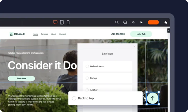
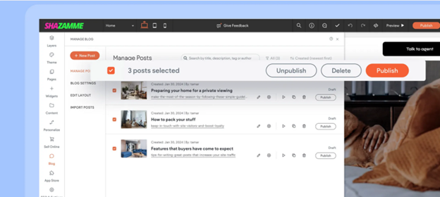
Introduction Recruitment has evolved beyond job boards and cold calls, digital recruitment marketing is now essential for agencies looking to attract top employers and candidates. With the right digital channels, recruiters can expand their reach, nurture leads, and enhance employer branding, making it easier to connect with the right job seekers and businesses. This blog explores how recruitment agencies can leverage digital channels including email marketing, social media, paid advertising, and SEO to build a strong recruitment marketing strategy. Plus, we’ll discuss how Shazamme’s AI-powered technology helps agencies maximize their digital efforts. Let’s dive in. 1. Leveraging Email Marketing for Candidate and Employer Engagement Email remains one of the most effective digital marketing channels for candidate engagement and employer attraction. When done correctly, email marketing for recruitment nurtures relationships, builds trust, and drives conversions. Email Campaigns for Lead Nurturing A well-planned email campaign helps agencies keep both candidates and employers engaged over time. For Employers: Send personalised emails with industry insights, hiring trends, and candidate success stories. For Candidates: Deliver job alerts, career advice, and application updates. Newsletters for Brand Authority A monthly recruitment newsletter strengthens your agency’s reputation. Include: Latest job openings in specific industries. Case studies showcasing successful placements. Hiring tips and market trends for employers. Personalised Follow-Ups and Feedback Candidates and employers appreciate clear, timely communication. Automated yet personalised email sequences keep applicants informed and increase engagement rates. Pro Tip: AI-powered email automation tools can personalise content, segment lists, and optimise email send times to increase engagement and conversions. 2. Optimising Social Media for Recruitment Social media isn’t just for brand awareness, it's a powerful hiring tool that helps recruitment agencies connect with both employers and candidates in a meaningful way. Best Social Media Platforms for Recruitment LinkedIn: Best for B2B recruitment, industry networking, and employer branding. Facebook & Instagram: Great for employer engagement, job postings, and culture-focused content. TikTok & YouTube: Useful for recruitment marketing videos, employee testimonials, and Q&A sessions. Twitter (X): Ideal for real-time job updates and industry conversations. How to Use Social Media for Employer & Candidate Attraction Employer-Focused Content: Share success stories, hiring strategies, and industry insights. Candidate-Focused Content: Post job openings, interview tips, and career advice. Engaging Video Content: Use short-form videos on TikTok, Instagram, and LinkedIn to boost engagement. Social Media Advertising for Recruitment Paid social ads allow agencies to target specific employers and candidates based on location, job role, and industry. Example: Run a LinkedIn campaign targeting HR managers in tech companies looking to hire developers. Pro Tip: AI-powered social media automation tools can schedule posts, analyse performance, and optimise content for better reach. 3. Driving Targeted Results with Paid Advertising Paid ads are one of the most cost-effective ways to attract high-quality candidates and employers at scale. PPC Advertising for Recruitment Agencies Pay-per-click (PPC) ads allow recruitment agencies to: Target employers looking for hiring solutions . Attract candidates searching for job opportunities . Appear at the top of Google searches with Google Ads . Example PPC Strategy: Use Google Ads with keywords like "best recruitment agency for IT jobs" to attract employers in the tech sector. Facebook & LinkedIn Ads for Employer & Candidate Attraction Social media ads are highly effective for recruitment because they allow for precise audience targeting . LinkedIn Ads: Best for B2B recruitment and employer engagement . Facebook & Instagram Ads: Ideal for promoting job opportunities and brand awareness . Competitor Keyword Research for Paid Ads Recruitment agencies should analyse competitor PPC campaigns to: Identify high-performing keywords . Discover which ad formats drive the most engagement. Optimise bidding strategies for better ROI . Pro Tip: AI-powered ad tracking tools can analyse ad performance, automate budget allocation, and improve targeting strategies for better conversions. 4. Recruitment SEO: The Key to Long-Term Visibility Why SEO Matters for Recruitment Search Engine Optimisation ( SEO ) ensures your agency appears at the top of Google when employers or candidates search for recruitment solutions. How to Optimise Recruitment Websites for SEO Keyword Research: Identify high-ranking keywords like "top recruitment agencies for finance jobs" . On-Page SEO: Optimise job postings, meta descriptions, and blog content. Backlink Tracking: Use AI-powered SEO tools to monitor backlinks and domain authority . Mobile-Friendly Design: Ensure job listings and application forms work seamlessly on mobile. SEO vs. Paid Ads: Which One is Better? SEO: Long-term strategy that drives organic traffic but takes time to build. Paid Ads: Short-term strategy that provides immediate visibility . Best Approach: Combine both for maximum results . Pro Tip: AI-powered SEO tools can automate keyword tracking, suggest content updates, and optimise job postings for better rankings. 5. How Shazamme Helps Agencies Maximise Digital Recruitment Marketing Shazamme provides AI-powered recruitment marketing solutions that help agencies: Optimise SEO for higher search rankings. Automate social media content and scheduling. Generate AI-powered job listings that attract top talent. Seamlessly integrate ATS, CRM, and marketing platforms for a smooth hiring process. Shazamme’s AI-driven SEO technology helps agencies rank higher on Google while its automation tools streamline digital campaigns - ensuring better results with less effort . Future-Proof Your Recruitment Marketing with Digital Channels To attract top employers and candidates , recruitment agencies must leverage digital channels strategically. Email marketing nurtures relationships and boosts engagement. Social media builds brand visibility and connects with target audiences. Paid ads drive targeted traffic and increase conversions. SEO ensures long-term organic growth and higher rankings. With Shazamme’s AI-powered solutions , agencies can automate and optimise their digital recruitment marketing strategies for better efficiency, engagement, and results . Ready to revolutionise your recruitment marketing? Book a demo with Shazamme today! →